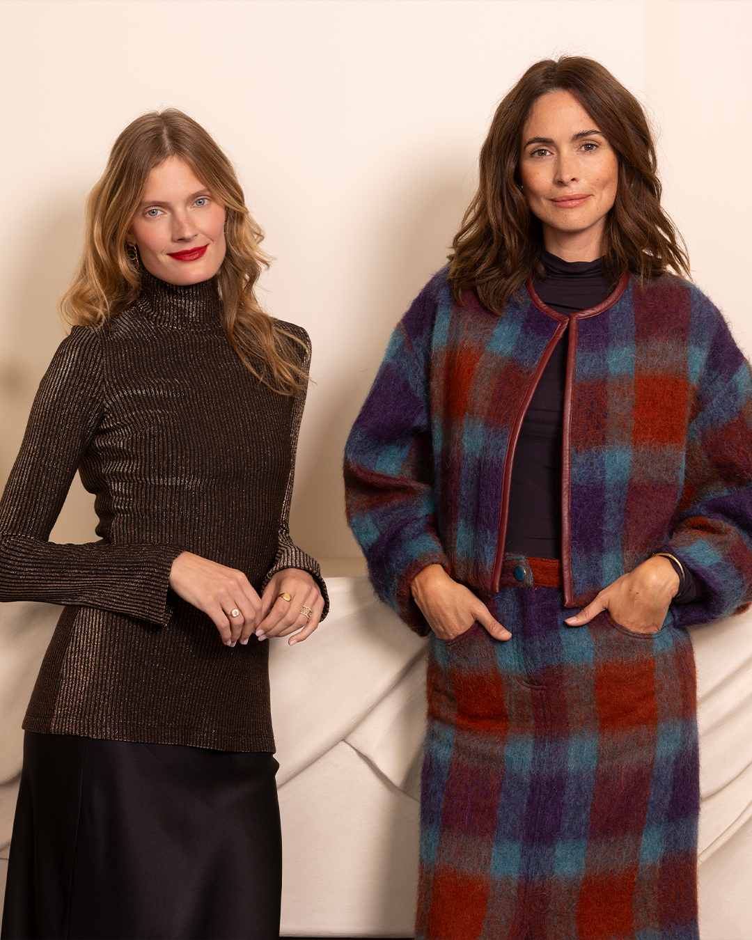
The Woman Behind Google’s Design
Courtesy of La Collection
ISABELLE OLSSON
The Woman Behind Google’s Design
By Bonnie Langedijk
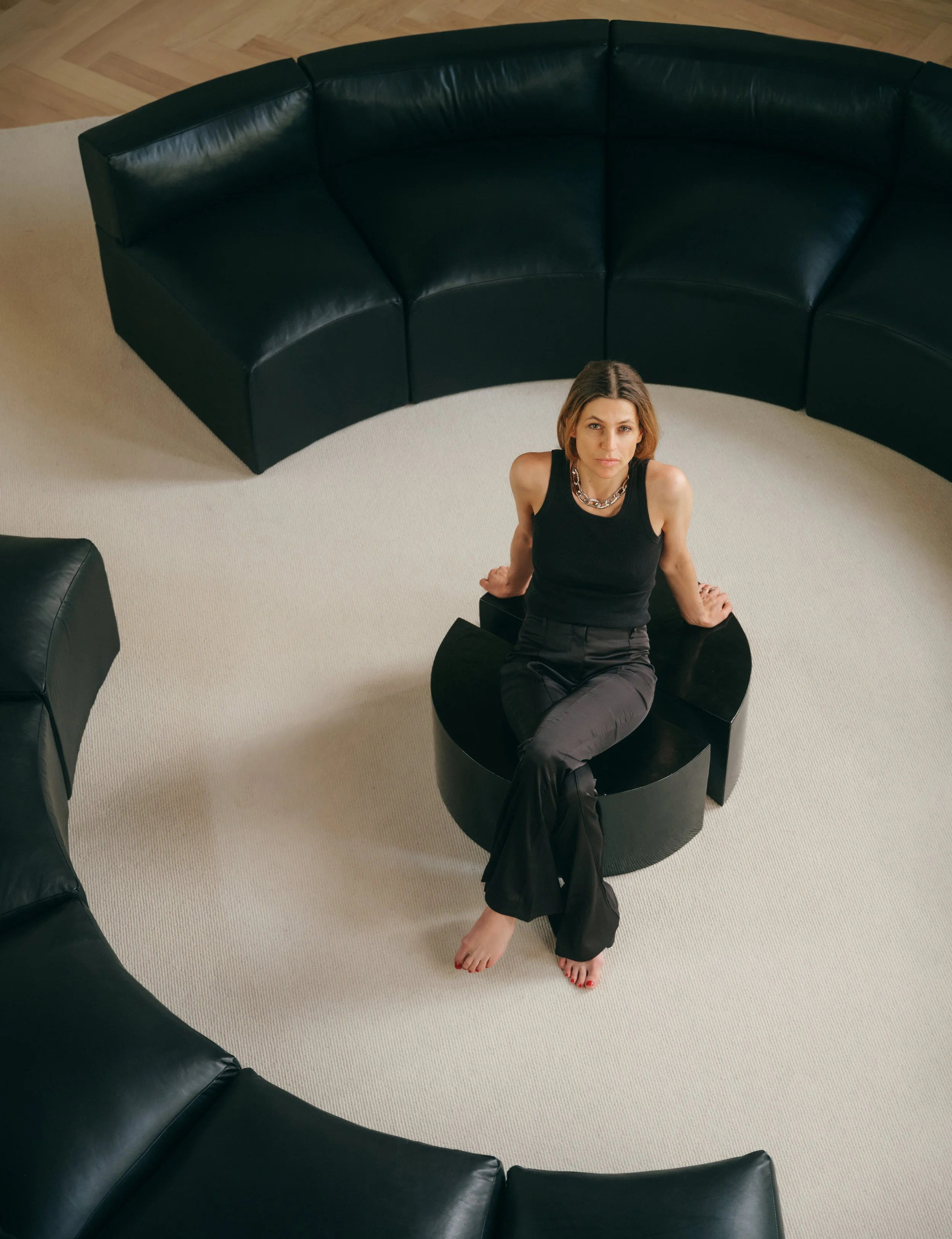
From our hands to our ears to our homes, we’re constantly connected to technology. But the way we interact with tech devices has evolved over time. From a TV that showed you limited options within specific programming, to home assistants that turn on the lights in your home at a specific time of day. The amount of tech we introduce into our homes and onto our bodies is expected to increase too. The global smart home market is forecasted to grow to over 182 million dollars by 2025, while the wearable market reached shipments of over 533 million dollars in 2021. And while these devices might create value when it comes to efficiency, many tech brands still don’t understand the importance of design for these products to seamlessly integrate into our homes and onto our bodies. Luckily, Google’s Design Director Isabelle Olsson gets it. Responsible for humanizing Google’s hardware, Olsson oversees the design of all Google Home and Wearable products, and also leads CMF (color, material finish) work across all of the tech giant’s hardware. Her aim? Creating a simple and smooth experience that allows for us to invite tech into our homes without having to compromise on design. We spoke with the designer about her grandfather’s Volvo, how she translated Google into physical products and how design can help us embrace technology.
Google’s FW22 products, designed by Isabelle Olsson. Courtesy of Google.
Bonnie: Do you remember the first design that really made an impression on you?
Isabelle: Yes, it was in my grandfather's Volvo. I was sitting next to him in the front and he folded up this armrest next to him and I asked, “What is that? I’ve never seen that before.” And he said, “Well, I custom made this thing because I want to be able to rest my arm and then I want to have all this storage here.” There was always something that he had hacked together or redesigned. I remember being amazed by the fact that you could create something from scratch. He had even matched the leather of the car. That was always his approach: if something wasn't working, he came up with a solution and made it his own.
“When we started making hardware, a lot of our work was around DEFINING what it means to hold Google in your hand, and how we can be an extension of that brand.”
It sounds like that approach of not just using design to make beautiful things, but to solve problems runs in the family. From there, how did you get to where you are now?
Isabelle: I've been tinkering with things my whole life. Whether it be sewing things, or making little prototypes or painting. I was always interested in maths and physics but I also had this art side and I thought they couldn’t be combined. Then I discovered industrial design and it was the perfect marriage of art and science for me.
It’s interesting because tech is part of our everyday lives, but the products don’t always fit into our spaces aesthetically.
Isabelle: We need it, but then how do we make ourselves want it too?
Exactly. Google is one of those rare brands that touches almost everyone. How do you create designs that appeal to such a diverse range of consumers, from different cultures to age groups to price points?
Isabelle: First of all, it's a huge responsibility to design for such a loved brand like Google. When we started making hardware, a lot of our work was around defining what it means to hold Google in your hand, and how we can be an extension of that brand. We wanted our products to express the essence of what people associate with Google. Early on we analyzed what the DNA of Google is and we came up with three words: human, optimistic, and daring. The human part was really inspired by how Google has always had this human tone of voice. Even when your chrome browser crashes, it says, "Oh, snap!". That human aspect and user-centered piece comes to life in very literal ways, the tactility, the textile, the soft forms, the inviting nature of our products and in how we try to make them easy to use and remove all the distractions. In terms of optimism, Google has always had this optimistic view of the future. We try to bring that to life in our products in a way that isn't juvenile, but has that playfulness that still has a premium aspect to it. The word optimism is also about an attitude towards the future. So how we're investing in sustainable materials and trying to build products that are better for the world. Then the last point is about being daring, and that's about daring to question the status quo. Why should things be the way that they've always been? It’s not just about being different for different sake, but being different and better. We boiled the Google brand down to the DNA and then translated that into something that is relevant for physical products. It also goes back to how we build our teams. Something my team and I have been really focused on is trying to build as diverse of a team as possible. We build products for everyone. So if we have a lack of diversity in our teams, we're not going to have that perspective.
The Google CMF studio. Courtesy of Google.
Absolutely. You often work on products that launch two or three years later. How do you make sure that, at least from a design point of view, they remain culturally relevant?
Isabelle: Part of it is making sure that we understand what the cultural relevance of trends are and where they're coming from. Is it a moment in time versus is it a movement? Is it something that's going to stick? One of the faster ways of looking at that is looking at adjacent industries that have a slower pace, furniture design for example. There's furniture that was produced in the sixties that you look at today and it feels modern. It's totally possible to create things that have a lasting aesthetic, that resonate with people. When we design products, we have to understand the context. Is it something that people are going to have in their house for 10 years, or is this a phone case that someone is going to carry around for six months? And based on that context we may take bigger risks or we may be inspired by things that are a little bit on the slower side. The context is your filter.
New technology can also be daunting for people. I can imagine approachability, or making a product feel like it’s easy to use is a big part of the puzzle too.
Isabelle: That's part of it for sure because the products are easy to use. Our job as industrial designers is to express that in physical form. You don't want something to look confusing if it isn't. It's almost like a cup and then you think it's water inside, you take a sip and then it's milk. It would taste horrible. If there's dissonance between what you expect and what it is, then the experience isn’t smooth. A lot of my job is to truly understand what the essence of the product is, so that we can express that visually and tactilely.
How do you know when you got it right?
Isabelle: You have to listen. Intuition is a collection of knowledge that you build for a long time and the design process is about speeding up that design intuition. It's everything from rapid prototyping, to then living with our prototypes and products in our own lives. We also do product impression studies, which is getting early impressions from people and getting them to word associate it. That's a fun process because it can paint a picture almost two years before you release a product of what you are going to see in those tweets when it comes out. We always try to make sure that whatever people word associate has a positive connotation. A lot of the time nobody has the intention to create something that people refer to as a trash can, but it might have been a miss in your mental model. You've been so close to something that you couldn't even see. It's a multifaceted, very intentional process to make sure we build things that land the way that we intended them to.
There have been a few negative stories in the media regarding big tech and about the influence it has on people. Can design change people’s perception?
Isabelle: It's human nature to reject things that we don't understand. That’s how we've evolved as human species to survive. It's not that surprising that some of these new concepts seem scary in some ways. Part of design is making [tech] understandable, but it's also about finding those solutions that give people peace of mind. For example, early on in the [Google] Assistant products we made a physical mute switch that would cut off the microphones. And I always felt "Well, that's great, but does that give you peace of mind? Would it be better if you can just literally switch it off? Just like a light switch?” Design can make it more inviting and more approachable, but also deliver functionality that responds to that human need to have peace of mind.
Details of the Google Pixel watch. Courtesy of Google.
Nest Wifi Pro FW22 colors. Courtesy of Google.
It’s funny you mention the light switch, because I think for humans it's so important for the new to have a connection to the old. For new products to have some sort of familiarity.
Isabelle: We talk a lot about grounding the unfamiliar and the familiar. That's definitely a part of the process.
That’s probably also easier when it comes to products for the home versus wearables. People are much more conscious and less willing to make compromises on what they wear.
Isabelle: This is where you have to hit that balance of making sure there's enough value for the cost that you pay. Not just the price point, but the comfort, the weight, the aesthetic of it. It has to match up. Some of the most successful wearables, like wireless earbuds, do a great job of grounding down into the familiar. They use a familiar form factor to deliver something new. I've not yet seen anybody successfully make the jump of delivering new technology in a new form factor. It's about meeting people where they are.
Speaking about meeting people where they are, some feel an uncertainty about the future and technology. What’s your take on it?
Isabelle: Anytime something is released to the world that is new, we call it technology. Think about cars back in the day or eyewear or TVs. More and more they become the fabric of our lives and they have improved our lives in so many ways. But we shouldn't be blind to the challenges that they bring too. We have to be cognizant about when technology is not helpful and call those things out and improve them. My hope is that with many of these concepts, we won't think about them as technology. We’ll think about them as our everyday experiences.
This interview has been edited and condensed for clarity.


