That Great Logo? Paula Scher Probably Designed It.
Courtesy of Pentagram
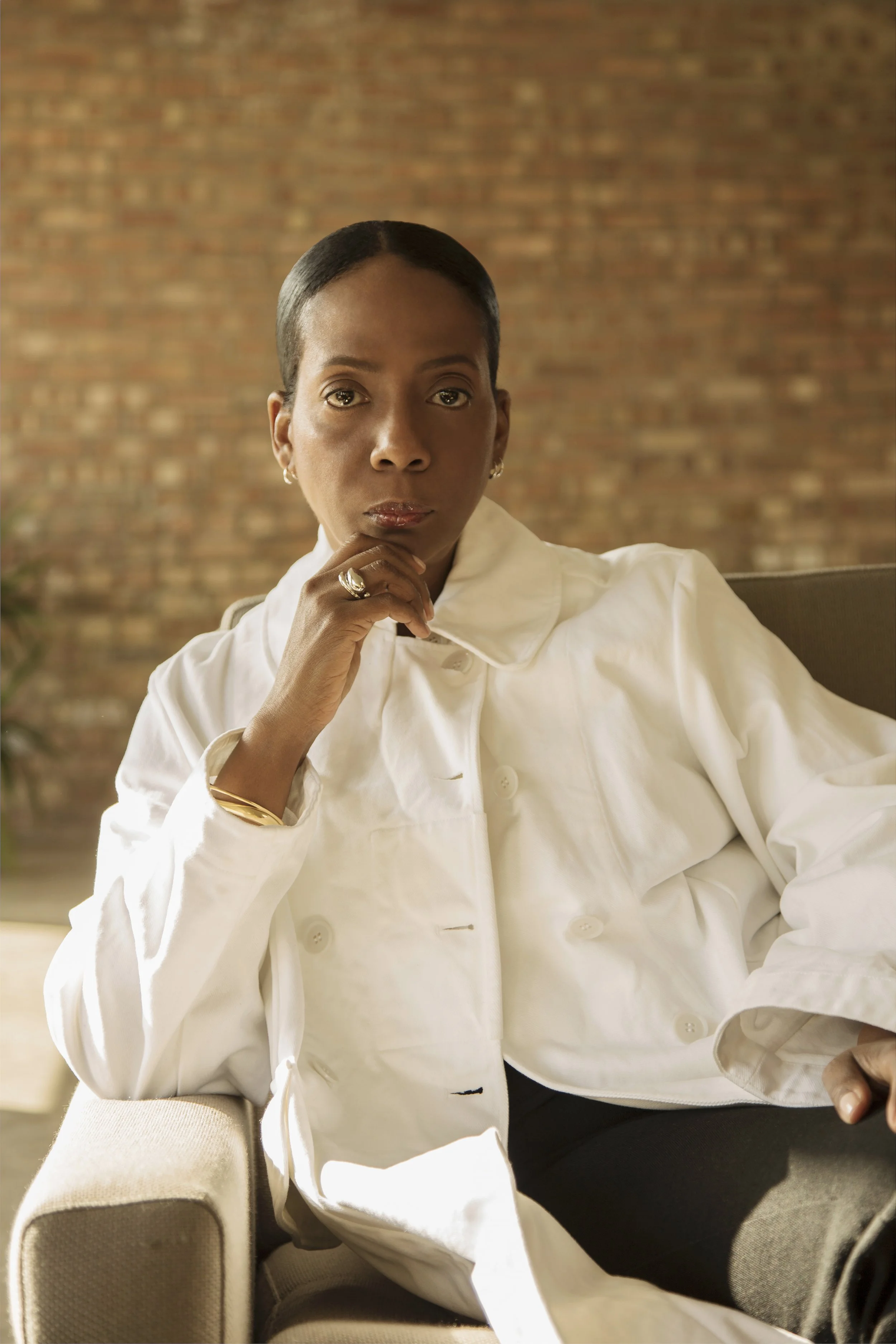
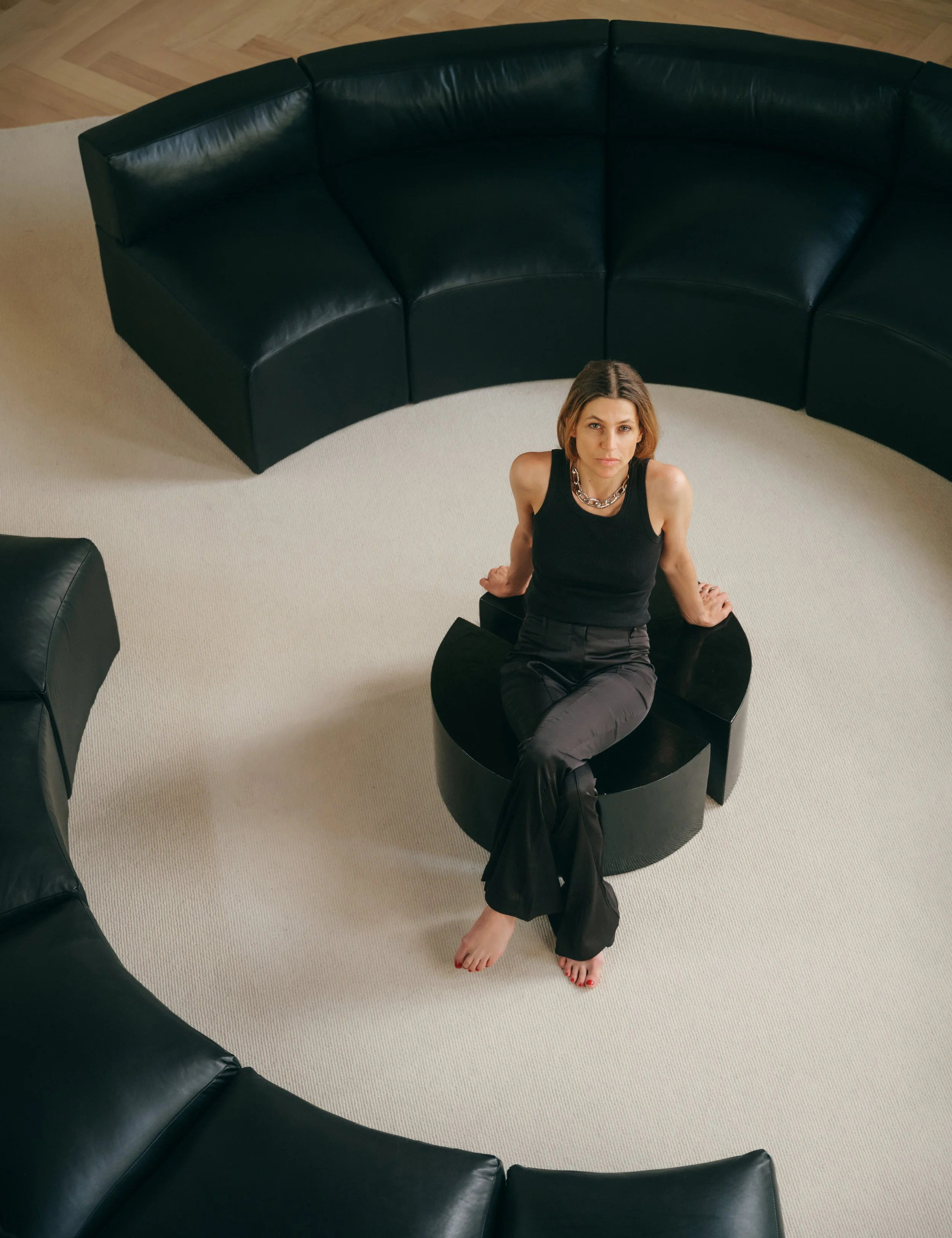
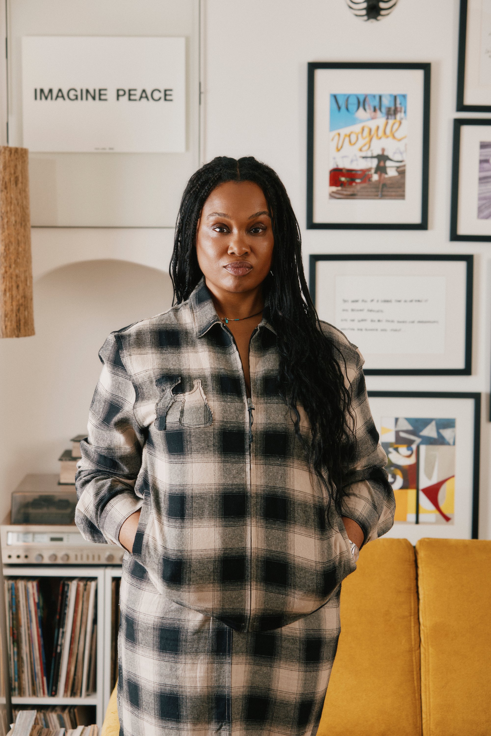
Paula Scher
That Great Logo? Paula Scher Probably Designed It.
By Bonnie Langedijk
For over four decades, American Paula Scher has pushed the boundaries of graphic design. She began her career as an art director, and has been a partner in the New York office at iconic design studio Pentagram since 1991. As a partner – she was the first woman to join the studio – Scher creates visual identities for the biggest brands and institutions including Microsoft, Citibank, Tiffany & Co., the Highline and the Museum of Modern Art.
In a world where most who design the brands we love remain anonymous, Paula Scher has become one of the most influential graphic designers of our time. Her renowned identity for The Public Theater, created in the mid-1990s, put her on the map as one of the key tastemakers in the field. Throughout her career, Scher has blurred the lines between pop culture and fine art, familiarity and surprise. With her state of the art approach to typography and graphic design, Scher continues to redefine what our world looks like.
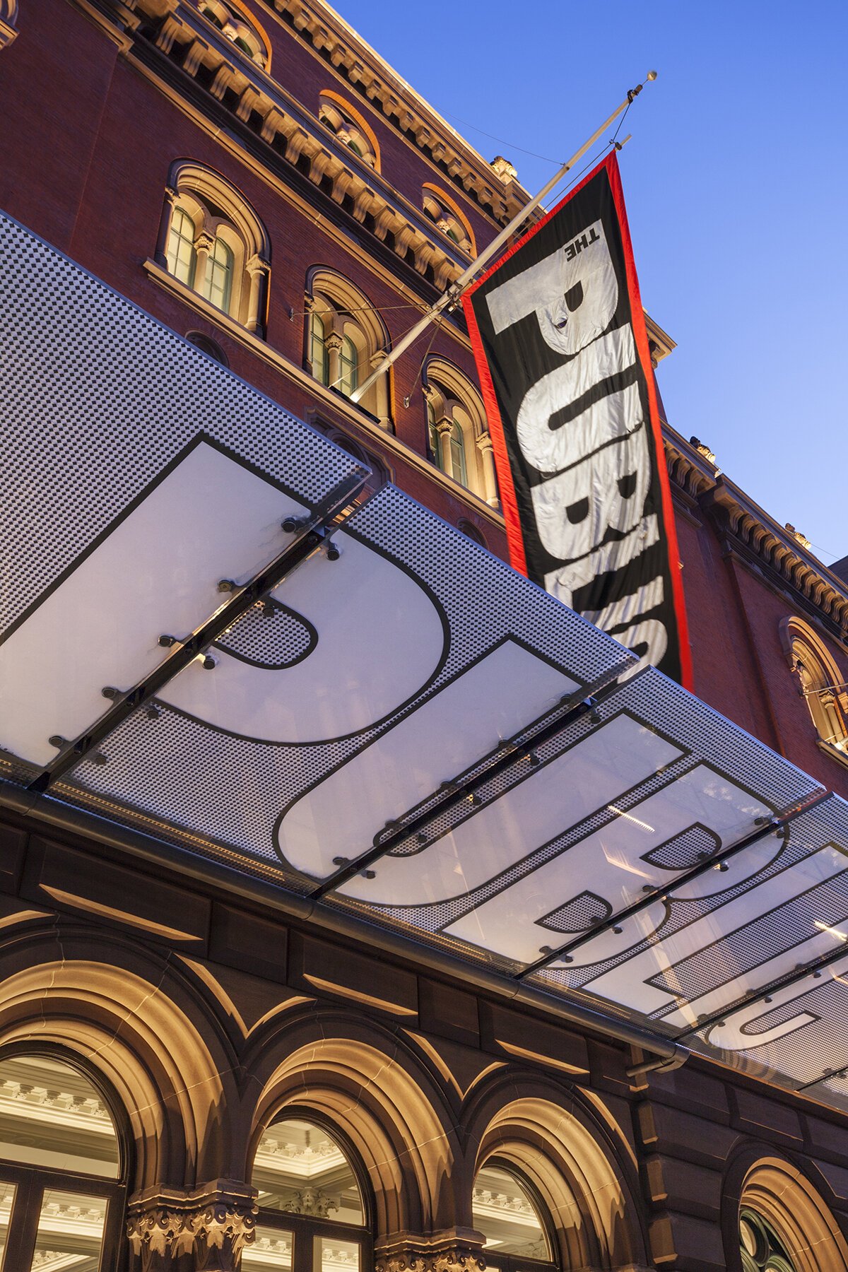
The Public Theater, identity designed by Paula Scher. Courtesy of Pentagram
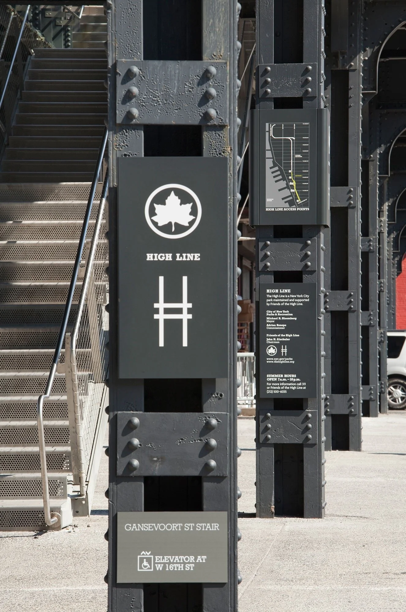
High Line identity designed by Paula Scher. Courtesy of Pentagram
Bonnie: What do you think the importance of design is? And do you think it has changed over the years?
Paula: I can talk most knowledgeably about graphic design. The biggest difference I’ve seen is what happened when the computer became prevalent in terms of how people communicated. We moved from a verbal culture to a visual culture. People began to notice differences in design that they didn't see before because they would have to pick a typeface for their computer. They would pick all kinds of goofy ones initially because they could tell the difference between them. Later, people began to see nuances like the difference between a sans serif and serif or between weight or power. They began to interpret how something looked in relation to the product or service it was talking about. That was new. Before, the reliance was 90% on taglines. Nike had developed a strong mark and the slogan that said “Just do it”, but they didn't have to show that anymore because the materials they put out had such a specific look to them that you didn't even need the messaging to a degree.
“We moved from a verbal CULTURE to a visual culture. People began to notice differences in design that they didn't see before because they would have to pick a typeface for their computer.”
Design has also become more about the experience users want across different media, and how design can play a role in that. How does that affect the way you work?
Paula: That's the way we create as designers now. You don't just think of a logo and that's it. You're creating visual languages. They have to be connected because you have to recognize that it's the same brand, while adapting to different environments. The brand has to feel human. As a person, you're the same person, but you change your clothes in different environments.
Completely. Has that also changed what clients want?
Paula: Yes. We're expected to create positioning statements, help them develop strategy, naming, copywriting, every service an agency provides. But the one thing that’s really fundamental is the logo. Identity systems start with something that's supposed to be sacrosanct and foundational and that stays over a long period of time, which is your logo. That’s what becomes recognizable in relation to the organization, product or service. The other things are much more temporary. You have to be able to create new promotions when they need to occur, you have to change Instagram almost every day. They're very different things that have to be thought about at the same time. And one doesn't necessarily lead to the other. That's where I find my biggest frustration is that you can change your copy line on a daily basis, you can’t change a logo on a daily basis.
Shake Shack identity designed by Paula Scher. Courtesy of Pentagram
And it’s easy to recognize the brands that have done the foundational identity work and which ones are relying on fleeting moments more than they should.
Paula: If a company isn't sure of itself, it will change their logo every three years. It will try to reinvent itself that way to succeed. I think that's a mistake. When I designed the Citibank logo nearly 25 years ago, the reason for the logo was about a merger between the Travelers Insurance Company and Citigroup. Of course the business isn't about that at all anymore but it doesn't matter because people recognize that thing. They make their own meaning for the logo because they already recognize it as this big giant bank. When I spoke to them on the 20th anniversary of the logo, nobody knew it was about a merger with Travelers [Insurance Company]. They thought it was about optimism.
I often think we underestimate how much we relate to logos. You also see people get very emotionally attached to them, almost in a tribal way. The outrage when they just changed the I Love New York logo for example.
Paula: Well, the I Heart New York one, I totally get. It's a bad logo. Milton Glaser designed the I Heart New York logo through an advertising agency for a specific campaign for New York State and it had music that went "I love New York". What happened was that the promotion for New York State was seen by most people in the United States in the LaGuardia or Kennedy airport where they had the coffee cup and the t-shirt. I don't think that most Americans who are aware of the logo, thought it was anything but a logo for New York City.
It’s interesting when you think about the brief you’re given as a designer, what you do with that brief and how your design ends up living in the world. My dad was an art director and he always said that clients never really know what they want.
Paula: I like your dad.
Many brands seem to be afraid to stand for something whether that’s through their messaging or the way the brand looks. I always think it’s impossible to deliver something great if you’re trying to be for everyone.
Paula: That's right. The new brands that I've worked on are successful when the owner has a very clear idea of what they want to do. It’s usually an idea that's based on something they already know how to do. The best startup I ever worked on was Shake Shack. Danny Meyers, who was a chef and also a restaurateur who already had very successful upscale restaurants, thought that his childhood in the Midwest was shaped by all these hamburger places he ate at. He wondered why doesn't anybody make a good hamburger and charge $2 more? That was the premise for the business. Not shaking up the world or trying to cure acne. What happened as a result, which wasn’t in his plan because he wasn't thinking that way, was he actually founded something that was called fast casual dining. It's a hamburger joint, but it's a good one. To me, that’s completely interesting. It didn't start from the list of bullet points that you resolve when you're really helping somebody develop their brand. It started with somebody who had a passion for food.
Design for Planned Parenthood by Paula Scher. Courtesy of Pentagram.
Graphics for Atlantic Theater. Courtesy of Pentagram
Do you have any design principles you will never stray from?
Paula: There are companies I won't work for. They go against my personal principles and so I just won't do the job. But that's personal and that's my own personal beliefs and political sensibilities. The other thing is: What is the goal of design? Is the goal of design in purely servicing the client or is there another bigger goal? My belief is that as a designer working for an organization or an individual I have to do the best job I can for them. My goal as a designer is to raise the expectation of what that design can be. In other words, if they're telling me: “I want to look like these other people in a row, let me make a mood board and I'll show you what the world looks like.” That's not the goal. The goal is to make them look like them, but allow them to feel comfortable that they’re going out to the party. Not overdressed, not underdressed, they're them. That's what I care about. Raising it, creating a surprise, moving the needle.
What’s been the hardest part about the work that you do?
Paula: To keep trying to push things forward without overdoing it. I'm very bad at estimating fees. I underestimate the amount of time it's going to take now. Design doesn't take a lot of time on the computer, what takes a lot of time are other people.
Talking about people, what was that like for you when you just joined Pentagram after having a business of your own?
Paula: That was wild. First of all, I was the only woman with 15 men. That was pretty strange. I joined deliberately because there was a moment at turning 40 where I knew if I didn't change, I would never grow. It was rough for women, particularly alone in business. I wasn't competing well for higher paying jobs and the jobs that were related to my work in the music industry were winding down because I started to get too old for it. So I was too young for corporate work or unbelievable as a woman and at the same time losing my youth oriented marketplace. At that particular point in time, Pentagram turned up and invited me to join as a partner. I wasn’t sure if I wanted to do it. Their earlier work was interesting, but the work that was coming out of the New York office was very corporate. I decided that if I wanted to make more money and grow my business, this probably would be a good thing to do. And it was the best thing I ever did.
How have you continued to evolve as a designer?
Paula: There are two things you have to keep in balance and I often have trouble with them myself. It’s about what's going on in the world financially, in science and digital, AI. Grappling with that, accepting that, and figuring out how you're going to function within that. The second is being true to yourself with your own attitudes about your work. Don't follow fads. Stay true to something that you understand and have a principle about and try to grow it.
This interview has been edited and condensed for clarity.

