The Ditting Effect

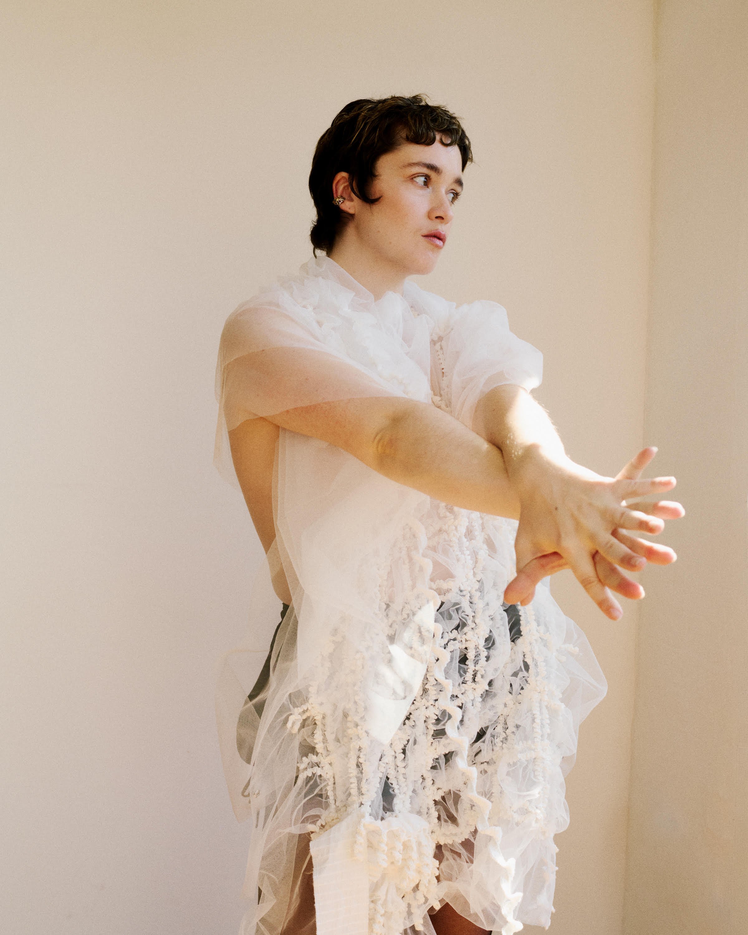
Sam Copeland for HURS.
Veronica Ditting
The Ditting Effect
By Bonnie Langedijk
Veronica Ditting’s edited take on today’s oversaturated world has made her one of the most sought-after creative directors of our time. Known for her work at the intersection of editorial design and branding, Ditting crafts elegant and distinctive visual narratives that are anything but minimal. From her studio at the Barbican in London, she collaborates with fashion houses, artists, photographers and cultural institutions to create award-winning magazines, art books and graphic identities. And with it, redefines the modern era of image making and graphic design.
Formerly the creative director of The Gentlewoman and guest artistic director of the iconic magazine Monde d’Hermès, Ditting’s distinct aesthetic has garnered her a loyal following of design aficionados. Something that’s unusual in a world where most who design the brands and publications we love remain anonymous. Today, the smartest brands, people and institutions in culture — from Hermès, Maison Margiela and The Row to the Stedelijk Museum Amsterdam and White Cube to renowned photographers Zoë Ghertner and David Sims — want to work with the creative director.
Ditting’s unique and meticulous way of working makes her consider the most trivial details – from the paper choice to the smallest typographic detail – while consistently connecting every creative decision back to the brand’s or collaborator’s overarching value system. Creating projects that aren’t just beautiful, but serve a bigger purpose.
Whether it's her collection of mini novels or her dislike for coffee table books, we thoroughly admire Ditting’s lens on the world.

The Gentlewoman. Photography by Oliver Hadlee Pearch, styling by Francesca Burns. Courtesy of Studio Veronica Ditting.

Louis Vuitton Spring Summer 2024. Photography by David Sims, styling by Marie-Amelie Sauvé. Image taken by Patrick Müller. Courtesy of Studio Veronica Ditting.
Bonnie: With a graphic designer, it's quite clear what they do. But then the term art director and creative director are used interchangeably. How would you describe what it is that you do?
Veronica: It depends on whom I’m speaking to, but I usually describe my profession as creative direction – the intersection of image-making and design. Creative direction revolves around defining the core and framework in all aspects of a project. Determining the editorial and visual values for a project, essentially the strategy. Whereas art direction is just one aspect within it. When it comes to image-making I collaborate with photographers, film makers and stylists on campaigns, fashion shows, publications and branding. I studied graphic design, so it’s a cornerstone of my practice.
“Creative direction REVOLVES around defining the core and framework in all aspects of a project. Determining the editorial and visual values for a project, essentially the strategy. Whereas art direction is just one aspect within it.”
It's part of that bigger system that you build as the framework. Growing up, graphic design is something you're probably not even aware of as a career option. How did you end up there?
Veronica: I grew up bilingual, therefore language has shaped my way of thinking. Learning a new language is actually one of my earliest memories. As a teenager I was interested in photography and design but had no idea which direction my work would or could take. At first I studied industrial design at an art academy in Germany. The curriculum was incredibly vague and the graphic design department seemed more vivid and engaging. This motivated me to switch over. Eventually I moved to Amsterdam and studied at the Rietveld Academy. It was an eye opener for how a personal take on language and graphic design can be interlinked with one another. Industrial design and looking at things from a constructional point of view still plays a role within my work.
I can definitely see that when I look at some of your work for Hermès for example. It seems to always have more than its singular purpose. I would describe it as a little surprise where there's often something that folds out or there's an extra note. Is that element of surprise something you think about? Or do they kind of just happen as you work on the project?
Veronica: When it comes to printed matter, I like to study a subject from different perspectives. For example, with Hermès Beauty, I've created the publications and invitations since its launch in 2020. The ratios of the publications are linked back to the actual beauty item and its packaging. This is why each publication looks singular. Four years later they’ve become a family of publications and a visual building block for the métier and Gregoris Pyrpylis, the creative director of Hermès Beauty.
More often than not a press package feels completely separated and disconnected from the actual product.
Veronica: Rouge Hermès, the very first publication in 2020, took inspiration from the lipstick’s primary packaging designed by Pierre Hardy. Cut chapter pages and an abstract color section offer structural moments within the publication. Color is an important aspect for Hermès – the house has an unparalleled depth of knowledge and history when it comes to it. Here, this structural treatment connects with the values of the house. The invitation for the métier’s first launch in Paris, equals three of the lipstick packages stacked on top of each other in length. Hermès Rose, the blush, was a square because that is the ratio of the actual product.

Hermès Beauty publications and invitations. Courtesy of Studio Veronica Ditting.

Hermès womenswear, press tool for the SS23 show. Cover photography by Nicolai Howalt. Still life taken by Qiu Yang. Courtesy of Studio Veronica Ditting.
And when you open it, it gives the same feeling as opening a compact blush.
Veronica: Exactly. It's about that connection. People might not really pick up on it at first, but it's something that might suggest looking at the publication in a different manner. All of the shoots are super specific to the launch. With Larissa Hofmann we worked on the most elegant how-to for Les Mains. Nikki McClarron shot portraits for Le Regard, the latest chapter. Each publication showcases a different photographic voice.
I like that combination of thinking big picture but then equally getting so detailed and nerdy.
Veronica: I reckon that is why the collaboration works really well, because Hermès is the house of details. It goes back to the idea of craft and design itself. I hear people collect the publications, which is the most thrilling compliment.
Circling back to language and how important that was for you. How does language inspire your editorial work?
Veronica: Establishing an overarching visual tone-of-voice is what can make editorial projects magical. Language is a tool to connect varied shoots and features. In an ideal scenario, image and text really sink into each other within layouts. Even the sound typography creates on a page is something to consider! Obviously everything starts with the commissioning of the content, the editing and design process should result in an engaging rhythm of the material. At the moment, make-up artist Lucy Bridge and I are working on a self-initiated publication, exploring her work and the culture of beauty in a wider sense. Together we’re aiming to rephrase our editorial work. I’ve never been a designer who simply receives material and finds a form for it.
I love looking at old ads, because there was so much more text and it was much more editorialized. Even when you think about the language brands used to use, it was much more out there in terms of what it said, but the text was also bigger and more important than the image. We've become so image focused. Do you think brands are circling back to prioritizing text?
Veronica: Creating a fashion campaign is layered and the process of the image-making can be very complex. So much has to be communicated in one single image. Considering a strong text layer seems like one step too far to take and too time-consuming for many brands. That said, some houses have a history with copywriting, others do not. Here’s hoping!
Exactly. We see so many images daily. Do you think it's still possible to create something that stands out?
Veronica: We live in a world that's on the one hand a visual one, on the other hand, all of those visual moments are so fleeting. Preoccupying your mind with how to stand out just makes you lose focus. I prefer to think about how to make it specific within its context. Say for a fashion campaign you want to think about what is the essence, values and image of the subject you want to convey. Who to collaborate with to achieve the right expression. Sometimes I ask myself how we measure the success of a project? Is something successful because it performs well on socials? I think that's pretty, um...
It's kind of shallow and sad.
Veronica: It is. I’m not sure how this will be changing. It contradicts one another, but workflow on projects has strangely become more complex and imagery more simplistic.

The Gentlewoman, Mini magazine. Photography by Matthieu Lavanchy. Courtesy of Studio Veronica Ditting.

Ditting at het studio at the Barbican. Photography bt Sam Copeland. Courtesy of HURS.
That’s a great way of putting it. The concept of design often coincides with taste or style. How would you describe your own, and how do you look at the bigger concept of taste?
Veronica: My taste is obviously a given and I surely take countless decisions due to it, but I never actively think about it. Studying at Rietveld Academy, it was not about taste at all. I was lucky to study in a pre-social media world. Looking back at our graduation show a lot of projects probably wouldn’t be considered tasteful by today’s standards. However everyone had their own curiosity and interest they were exploring. Seeing an authentic thought process excites me more than good taste! Generally I probably think more about values. Clarity, confidence, and authenticity are the three core aspects that I always gravitate towards.
Do you have styles or words people use to describe your work that give you a bit of an adverse reaction?
Veronica: Especially when The Gentlewoman launched back in 2010, a lifetime ago, a lot of people would refer to my editorial work as minimal; a term I dislike. In terms of the process at my studio, the sense of clarity that we get to is anything but minimal. I would say my work is very edited – I look at things from different angles.
Minimal is such an overused term, maybe because it can mean so many different things. When you work on a new project are you thinking about the end user?
Veronica: Not really. If it’s a printed project, I think about scale, tactility and how you engage with it. In terms of photography, expressiveness and connection is something I strive towards. A lot of fashion photography I value originates from portraiture.
I think many people take a well-designed magazine or a well-designed book for granted. We all use computers now and we pick a font or the spacing, but beyond that, people have no idea how much goes into a project like that.
Veronica: Exactly. Back when I was at The Gentlewoman, for the celebratory 20th issue I came up with the mini [version of The Gentlewoman]...
Yes, how did you come to that?
Veronica: My parents owned a stack of pocket-sized dictionaries. Italian-German, French-Spanish and more, which we would take on holidays. Over the years I have collected more miniature books. The oldest I own is Bryce's Thumb English Dictionary from the 1860s.
I've never seen them before. It’s funny how the size doesn’t affect the reading experience.
Veronica: No, exactly. Simply put I circled back to the idea of how you hold something in your hand. The usual path for celebrations are coffee table books which are about looking backwards; I can’t stand the template-feel of these. The mini magazine contains the cover stories and measures 50 x 84mm small. 580 pages were meticulously reworked for this mini edition. For me, this spoke to the way I designed and creative directed the magazine. It sold out in no time.
What's the last great design you've come across?
Veronica: Two things come to mind. Do you know Lehni? The Swiss manufacturer of Donald Judd pieces? They have a really nice side table I would love to own. It’s actually from 1979! And the latest issue of MacGuffin, on the topic of The Letter. I’m friends with the team making it. I like the way they think and look at things. It’s inspiring to see an independent magazine with lots of personality.
This interview has been edited and condensed for clarity.